Every effect states its purpose
The DSL rejects a spec without one, and rejects "looks cool".
pattern particle-field · webgl
Patterns chosen by what a site is for, loaded only when they are needed, checked in a real browser, and still under reduced motion.
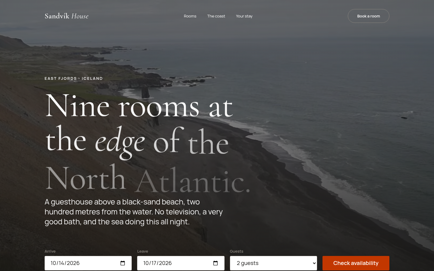
pattern video-zoom · gsap
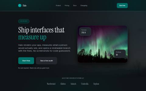
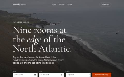
“Ocean waves at Lækjavik beach, Iceland” by Alexander Grebenkov, CC BY 3.0, via Wikimedia Commons.
pattern horizontal-scroll · gsap
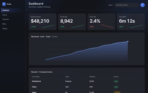
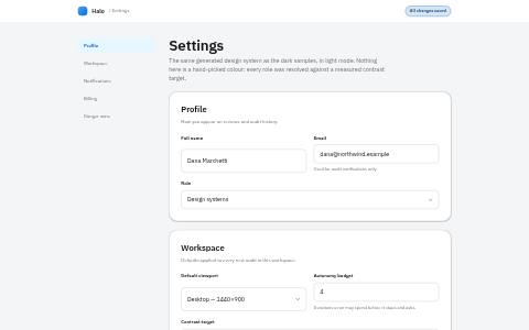
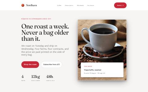


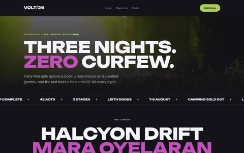
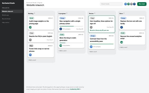
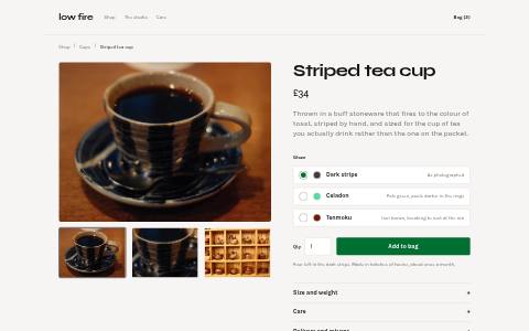
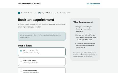
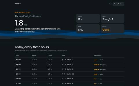
pattern stacking-cards · gsap
pattern perspective-scroll · gsap
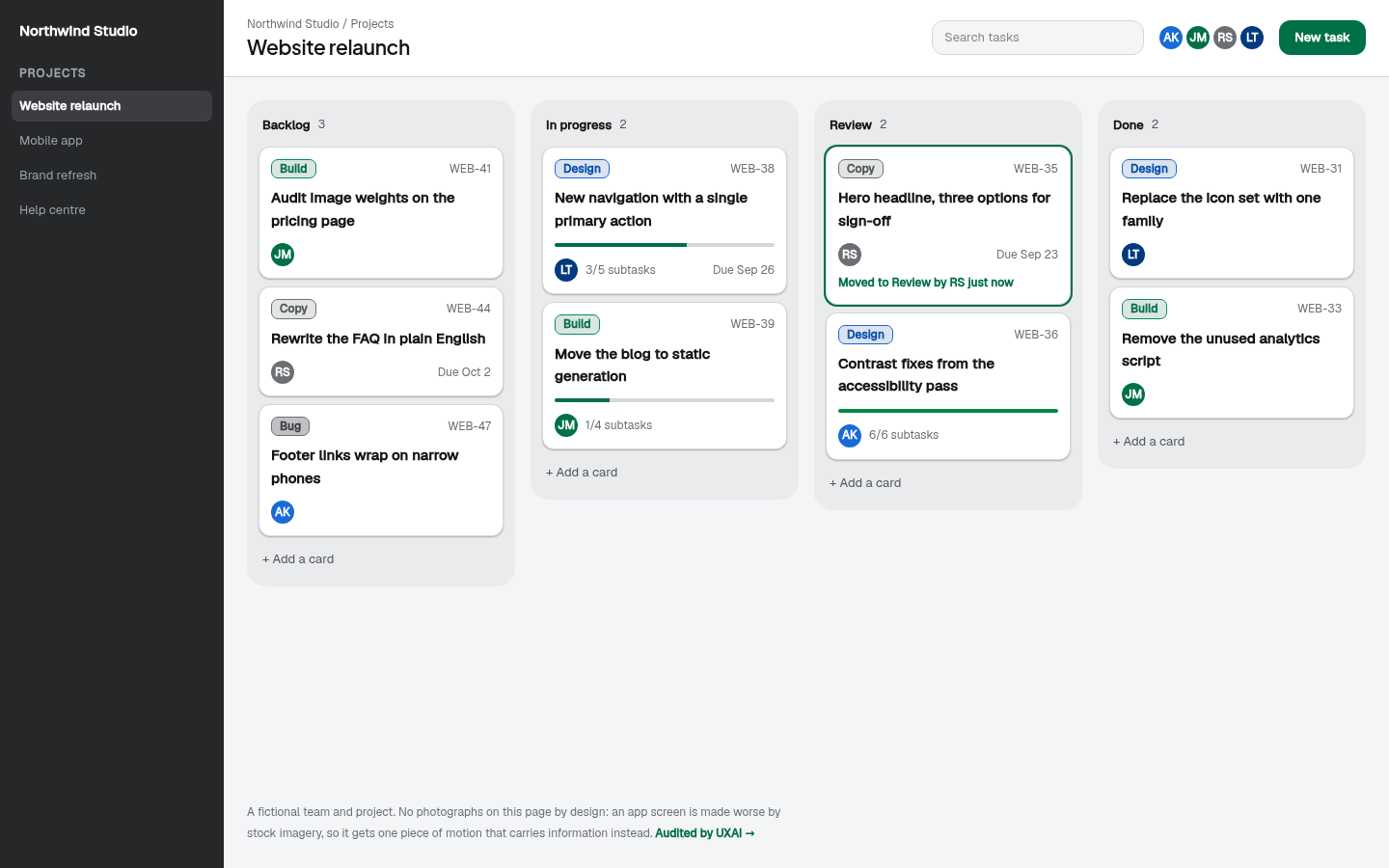
pattern 3d-tilt · css
The DSL rejects a spec without one, and rejects "looks cool".
GSAP, Lenis, Embla and Three.js load only for the specs that need them.
Scroll effects are never created, hover is off, WebGL is one frame.
pattern shared-element · css
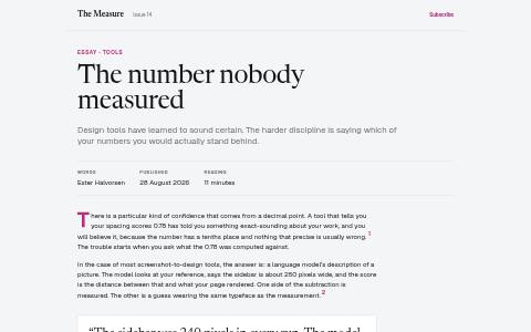
Each link below carries one transition type. The thumbnails above use the morph: the picture grows into the page it shows.
pattern product-viewer · webgl
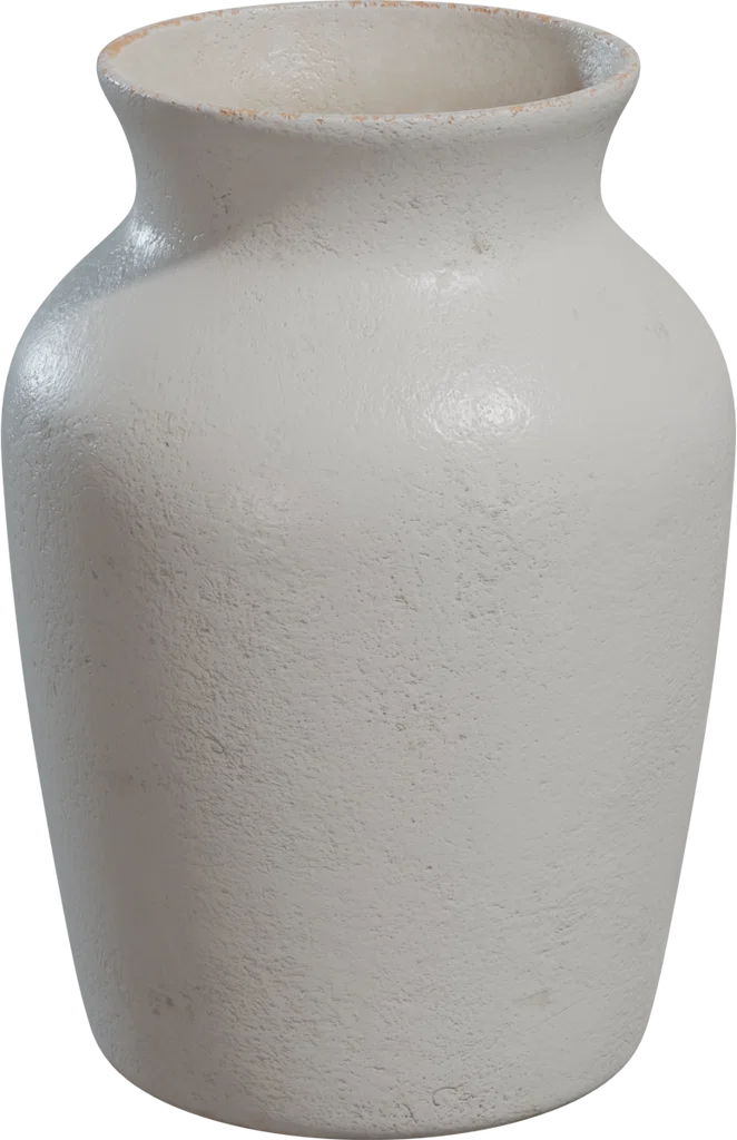
A CC0 model from the asset engine’s Poly Haven source: 2,756 polygons, 1k textures, about 730KB. Drag it, or focus it and use the arrow keys. Phones keep the still image.
3D model: "Ceramic Vase 02" by James Ray Cock via Poly Haven, CC0 1.0 (public domain dedication).
pattern slider-fullscreen · embla
pattern slider-horizontal · embla
39 patterns are built. 0 are planned, each with the reason it is not built yet.
hero · observer
Brings the hero in as one composed moment, headline first, so the first read has an order.
built
hero · observer
Sets a single headline word by word, for a statement that deserves a beat.
built
hero · gsap
The hero footage eases in as you scroll away, so leaving the hero feels like moving into the page.
built
hero · gsap
Separates foreground type from background image by depth.
built
hero · css
The primary button leans toward the pointer: a quiet invitation on the one action that matters.
built
scroll · gsap
Shows a row of related work as one sequence without leaving the section.
built
scroll · gsap
Holds one image still while its explanation scrolls past it.
built
scroll · observer
Uncovers an image from the bottom as it arrives, drawing the eye to it once.
built
scroll · observer
Section headings arrive as they are reached, setting the rhythm of the page.
built
scroll · gsap
A key image grows as it centres, putting weight on it without a caption saying so.
built
scroll · observer
Focuses an image into place once - a photographic "arrival".
built
scroll · gsap
Background moves slower than content, separating decorative layers from reading layers.
built
scroll · gsap
A product screenshot tips upright as it arrives, like a screen being set down in front of you.
built
scroll · gsap
Steps in a sequence stack on each other, so the reader feels progress through a list.
built
cards · css
A card tips toward the pointer, marking it as picked up without changing the layout.
built
cards · css
Lifts a card a few pixels under the pointer to say it is clickable.
built
cards · css
A card drifts toward the pointer - playful, for a small number of feature tiles.
built
cards · css
The image inside a card zooms slightly on hover, inviting a closer look.
built
cards · css
A soft ring trails the real cursor and grows over things you can click, for a portfolio that wants a tactile pointer.
built
navigation · css
The header gets out of the way while reading and returns the moment you scroll back.
built
navigation · css
The header settles into a compact bar once you leave the hero, so it stops competing with content.
built
navigation · css
On a phone, the navigation that was hidden becomes one tap away, filling the screen.
built
navigation · css
Menu items arrive one after another, so a full-screen menu reads as a list rather than a wall.
built
transitions · css
Same level, somewhere else: the old page leaves before the new one arrives, so they never compete.
built
transitions · css
A new chapter: the next page rises over the old one like a sheet.
built
transitions · css
The new page grows out of the point that was clicked, where attention already is.
built
transitions · css
The same thing, going deeper: a thumbnail grows into the page it shows.
built
transitions · css
A deliberate scene change: the old page settles back, the new one comes forward.
built
transitions · css
Moving deeper: content slides left, the reading direction of progress.
built
sliders · embla
A row of cards the reader drags or steps through, with real buttons.
built
sliders · embla
A looping row, for sets with no natural first item (testimonials, logos).
built
sliders · embla
Free-scrolling drag with momentum, for browsing rather than stepping.
built
sliders · embla
Vertical steps in a fixed-height frame, for a short sequence beside an image.
built
sliders · css
A CSS scroll-snap row: no library at all, for the simplest case.
built
sliders · embla
Full-width slides for a few large images, stepped by buttons, arrow keys or swipe - never on a timer.
built
3d · webgl
A slow drifting field of points behind a technology hero, reacting slightly to the pointer.
built
3d · webgl
One slowly turning wireframe object as a focal point.
built
3d · css
Layers inside a panel shift against the pointer by depth - 3D feel without WebGL.
built
3d · webgl
A real 3D model the visitor turns by dragging or with the arrow keys, for an object whose shape is the point.
built